

Who let the bears out?
Serving on-chain cuts.

I like systems, processes and routine.
Over the past couple of weeks I’ve been trying out different charts and data points for on-chain analysis that can support my trading - the array of available data points can be overwhelming especially if, like me, you also have a full time job.
And for those who are new to on-chain, getting blasted with all the acronyms like NUPL, SOPR, RHODL etc can be confusing.
It’s definitely exciting for someone like me to have access to a vast array of data, but in my time working as an analytics consultant I’ve learned that you need to also do a certain amount of reporting to keep up with the trend. A certain amount of routine.
Being a detective is the fun part, trawling through charts and data looking for new insights. Reporting, not so fun, but necessary.
This is how I fit on-chain analysis into my current trading system. Pick a set of 2 or 3 charts to start with and check them every day. Sounds simple enough? Good. It should be.
Below I’m going to go through 3 charts that are my “core vitals” for an on-chain + TA trading strategy. These core vitals focus around exchange flows. There’s many different ways to analyse on-chain data, you don’t have to look at exchange flows but I find them very useful.
I recently wrote about using exchange flows in combination with technical analysis as a guest post for the Espresso over at Jarvis Labs. Check it out here!
What I’m doing is looking at price action and putting it together with supply and demand to improve my chances of success in trading.
And trading is about probabilities, no one can be right all the time but you can improve the odds and level the playing field.
Go away bears!
There’s been some pretty bearish price action recently. The hype around the Coinbase IPO has faded and Biden announced he wants to increase capital gains tax for the very wealthy. Despite just being a proposal at this point we have a lot of sellers in the market.

Bitcoin lost a major support level around 51k and conducted a convincing bearish retest. 51k is resistance for now.
Doing post-mortem analysis reveals why, upon the announcement out of the US, Bitcoin Exchange Netflow swung positive. People started transferring their Bitcoin onto exchanges increasing the supply in the market.

It is slowing down a little but netflow is still positive.
Looking at ETH, we see the same thing except, it’s not slowing down! Netflow is increasing, lots of ETH is turning up on exchanges right now and that’s make me hedge a little bit into USD so that I can buy any dip that comes along.
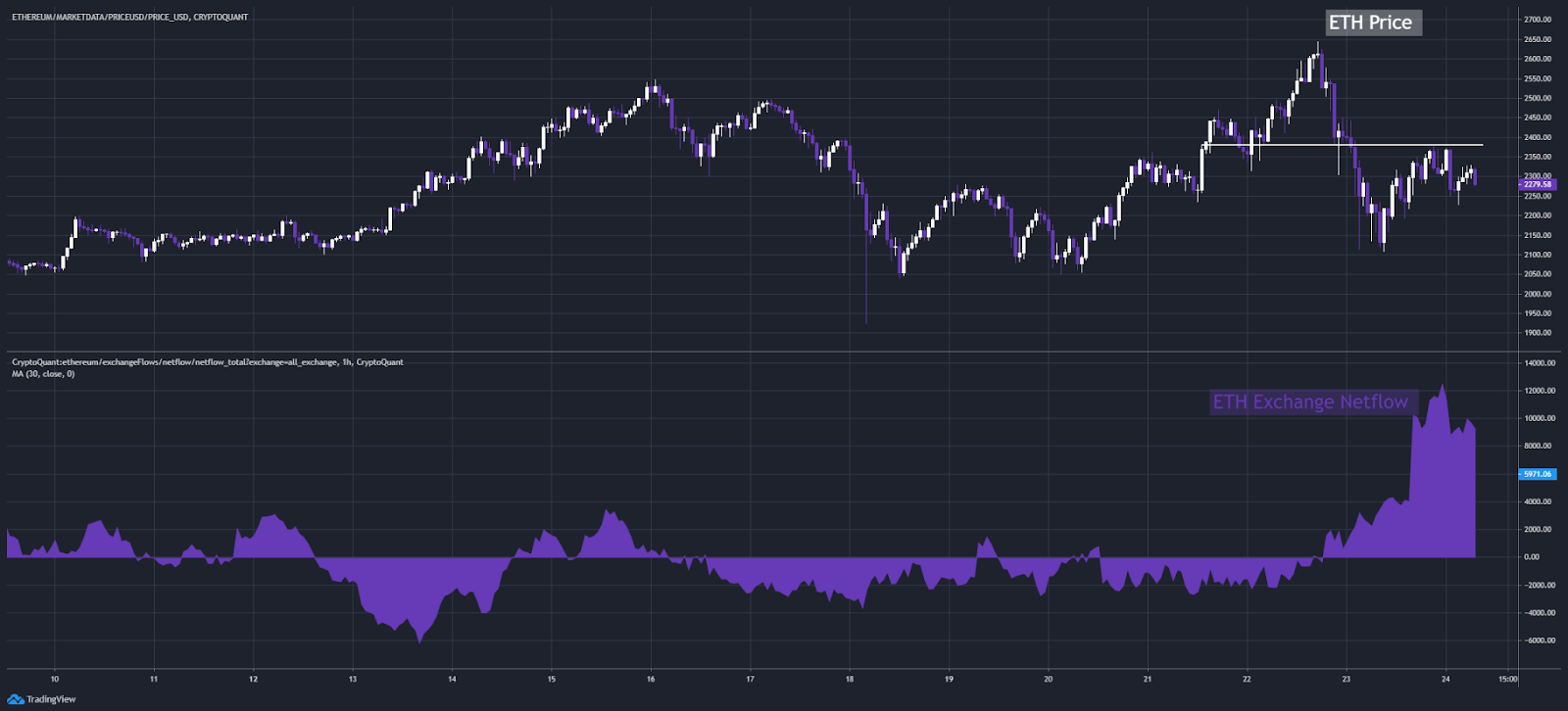
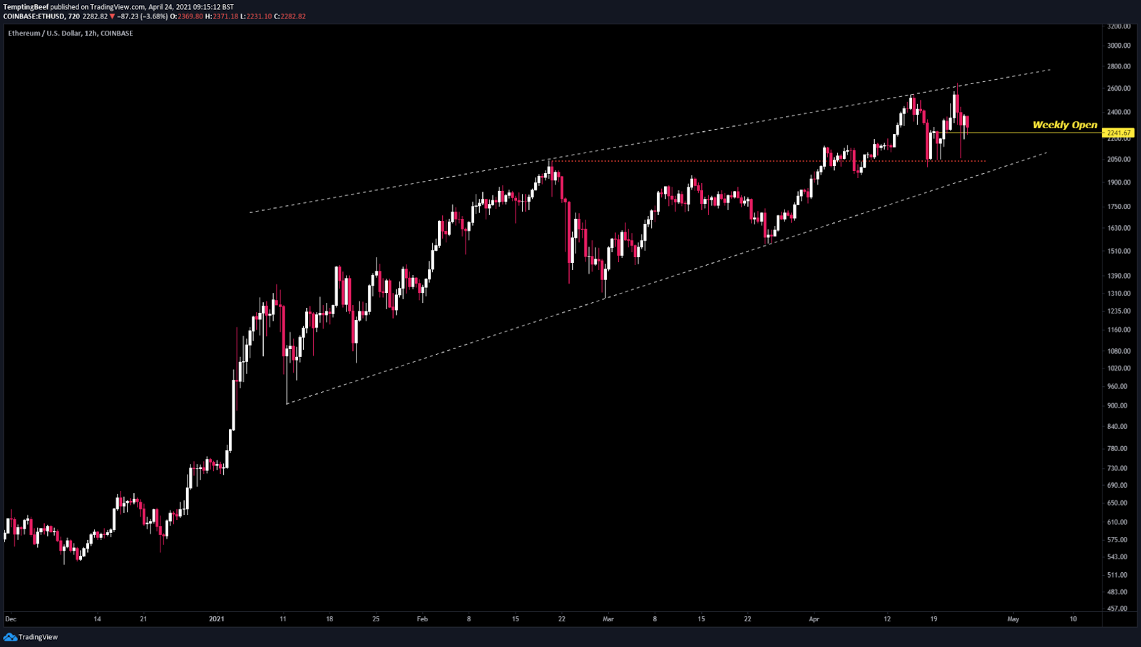
TA for ETH looks like it’s defending the weekly open right now but next major support is likely around the previous ATH of 2k.
So the supply is still there in the market. We need an equal amount of demand to at least go sideways rather than down.
Looking at stablecoin exchange netflows, demand did return over the last 12 hours resulting in the lower high we posted on both BTC and ETH.

However, in my opinion it looks like demand oscillates quite frequently, it’s good in the sense that the market has good liquidity to respond to demand, but it also means that if we see stablecoin netflow swing negative again, supply will start to take over and downside will likely ensue.
Summary
To wrap up:
Supply: High
Demand: Moderate
TA: Bearish
Outcome: Likely we see sideways action or maybe a little downside.
I’m ready to buy a dip on ETH at 2k, if it comes.
I’ve published my charts on CryptoQuant here:
Got Beef,
@tempting_beef
Keep writing/analyzing! Love the clarity of thought you provide.